AlertDialogPro
介绍:
在安卓中要改变AlertDialog的外观是非常不容易的事情,即便是HoneyComb之后增加了android:singleChoiceItemLayout属性。AlertDialogPro可以让事情变得简单,它包含了AlertDialog的所有功能,同时还具有灵活的自定义功能,代码中还自带了已经定义好的holo和material 两种风格的对话框。
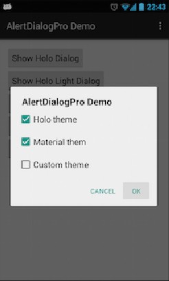
运行效果:
使用说明:


1.创建AlertDialogPro
除了将AlertDialog.Builder替换成AlertDialogPro.Builder之外其他的和AlertDialog没有区别。
AlertDialogPro.Builder builder = new AlertDialogPro.Builder(getContext());
builder.setTitle("Title").
       setIcon(R.drawable.ic_launcher).
       setMessage("Message").
       setNeutralButton("Neutral", null).
       setPositiveButton("OK", null).
       setNegativeButton("Cancel", null).
       show();
2.holo风格的dialog
包含两种holo:
Theme.AlertDialogPro.Holo``和Theme.AlertDialogPro.Holo.Light
只需在style文件中加入`alertDialogProTheme`属性:
<style name="AppTheme" parent="AppBaseTheme">
  ...
  <!-- Use Holo dark theme as global theme of this app -->
  <item name="alertDialogProTheme">@style/Theme.AlertDialogPro.Holo</item>
</style>
或者是在代码中创建dialog的时候设置:
AlertDialogPro.Builder builder = new AlertDialogPro.Builder(getContext(), R.style.Theme_AlertDialogPro_Holo_Light);
3.`` `Material` ``风格的dialog
`包含Theme.AlertDialogPro.Material` 和`Theme.AlertDialogPro.Material.Light` 两种风格,使用方法和上面的holo差不多,但是需要AppCompat-v21的支持。
4.自定义
如果其中某一种风格符合你的绝大部分需求,但是需要做些改动,你可以设置以下属性:
<!-- Minimum height of title panel-->
<attr name="adpTitleMinHeight" format="dimension" />
<!-- The text appearance for the dialog's message text -->
<attr name="adpMessageTextAppearance" format="reference" />
<!-- Minimum height of ListView's items -->
<attr name="adpListItemMinHeight" format="dimension" />
<!-- The text color for ListView's items -->
<attr name="adpListItemTextColor" format="reference|color" />
<!-- The text appearance for normal ListView's items -->
<attr name="adpListItemTextAppearance" format="reference" />
<!-- The text appearance for "multi-choice" ListView's items -->
<attr name="adpListMultiChoiceTextAppearance" format="reference" />
<!-- The text appearance for "single-choice" ListView's items -->
<attr name="adpListSingleChoiceTextAppearance" format="reference" />
<!-- Divider for the ListView -->
<attr name="adpListDivider" format="reference" />
<!-- Selector in a ListView -->
<attr name="adpListItemBackground" format="reference" />
<!-- Style for button bars -->
<attr name="adpButtonBarStyle" format="reference" />
<!-- Style for buttons within button bars -->
<attr name="adpButtonBarButtonStyle" format="reference" />
<!-- Style for the "positive" buttons within button bars -->
<attr name="adpButtonBarPositiveButtonStyle" format="reference" />
<!-- Style for the "negative" buttons within button bars -->
<attr name="adpButtonBarNegativeButtonStyle" format="reference" />
<!-- Style for the "neutral" buttons within button bars -->
<attr name="adpButtonBarNeutralButtonStyle" format="reference" />
你甚至可以设置alertdialog的整个布局,如果你需要的是高度自定义的dialog,这是非常重要的。
<style name="AlertDialogPro.Material">
  <!-- As HoneyComb's android:layout.
       Specify your AlertDialogPro's layout -->
  <item name="adpLayout">@layout/adp_alert_dialog_material</item>
  <!-- As HoneyComb's android:listLayout.
       Specify your AlertDialogPro's ListView layout. -->
  <item name="adpListLayout">@layout/adp_select_dialog_material</item>
  <!-- As HoneyComb's android:listItemLayout.
       Specify your AlertDialogPro's list item layout. -->
  <item name="adpListItemLayout">@layout/adp_select_dialog_item_material</item>
  <!-- As HoneyComb's android:multiChoiceItemLayout.
       Specify your AlertDialogPro's multi choice list item layout. -->
  <item name="adpMultiChoiceItemLayout">@layout/adp_select_dialog_multichoice_material</item>
  <!-- As HoneyComb's android:singleChoiceItemLayout.
       Specify your AlertDialogPro's single choice list item layout. -->
  <item name="adpSingleChoiceItemLayout">@layout/adp_select_dialog_singlechoice_material</item>
</style>
使用上面自定义的alertdialog
<item name="alertDialogProStyle">@style/AlertDialogPro.Material</item>
已下载
0